This is a personal note on how to efficiently automate icon creation with Inkscape, but you may find some helpful tips for yourself here.
This is a supplementary article to The Complete Guide to Favicons and App Icons 2022. This workflow was created to make it easy to export icons for multiple websites. This is a fairly individual workflow and this article is mainly for personal notes. However, you can find some useful tips for your own workflow. I show an example with open source Inkscape.
Let's start
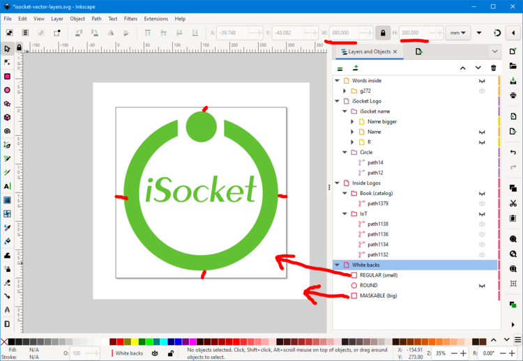
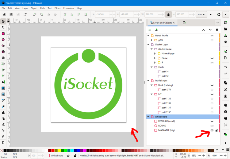
Create a square page and place your logo with small margins, but not large margins, otherwise you will lose a lot of space for apple-touch-icon and favicon. Place a background layer of the same size - the background color depends on your logo, in our case it is white. Add another layer for a maskable icon - it also needs to be a square background (again in our case white) and here's the trick - yes, it's outside of your page! How do I find out how much free space is needed for the maskable icon? You can see the proportions in the screenshot, or you can test your result here and adjust, or you can test it directly in the browser - see the screenshots in the Icons 2022 Summary chapter of this article.
Favicon
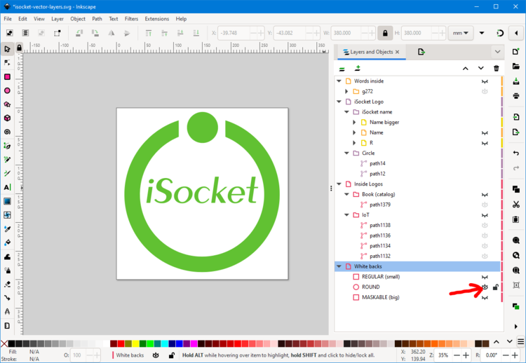
First we want to create a favicon. As decided, it should be a PNG sized 48x48 pixels. For a special look, we want it to be on a white background this time, round like a logo. For this purpose we have another round background layer. We disable the other two square backgrounds and enable this one:
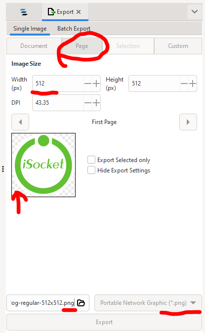
We are exporting a page, not a document or selection:
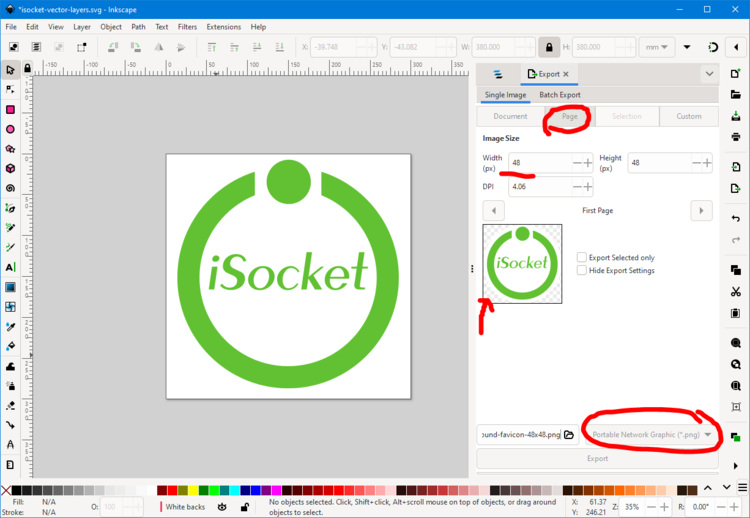
We resize to 48px and export to PNG. Since our page is square, it's not filled (i.e. transparent) and we have this white circle in the background, we'll get the result we want - a round icon that will be round in both dark and light themes.

Apple touch icon
This one should be square and shouldn't be maskable, and I'm pretty sure it shouldn't have a transparent background (see my research on icons with transparent backgrounds and their behavior on the iPhone). In our case, the background is white, so enable this layer:

and export again as a 192px page:
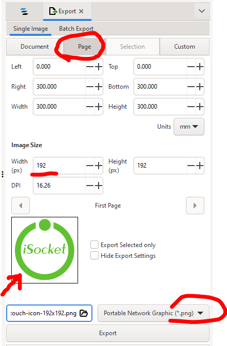
and we get the following result:

These are the settings for export, they are set by default and are quite good:
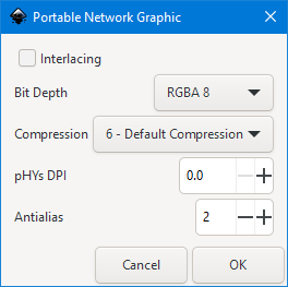
I've noticed that sometimes a PNG is too big when exported from Inkscape, so you probably need to re-export it with some other software you have, like Photoshop.
Maskable icons for the manifest file
Now we want to export the maskable icon, so we activate this background layer:
Because the layer is outside of our page, we are now exporting a document, not a page. First we want to export the SVG. The width you set doesn't matter because it's a vector - it will set the width/height to match the page, but again you don't care. Plain SVG works fine for me and I don't know why unchecking "Hide export settings" would actually hide them if it should be the other way around:
Anyway, when I open this SVG, I see some issues with the viewBox and sizes, and I want to fix it manually:
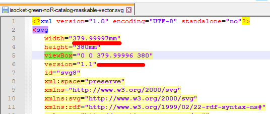
And then it's up to you to decide how to get two more PNG icons - 512x512 px and 192x192 px. You can either import your SVG into Photoshop and export from there because you see that Inkscape creates too big file and/and you need a control settings (but use PNG24 and be careful with transparency) or you can export directly from Inkscape like this :
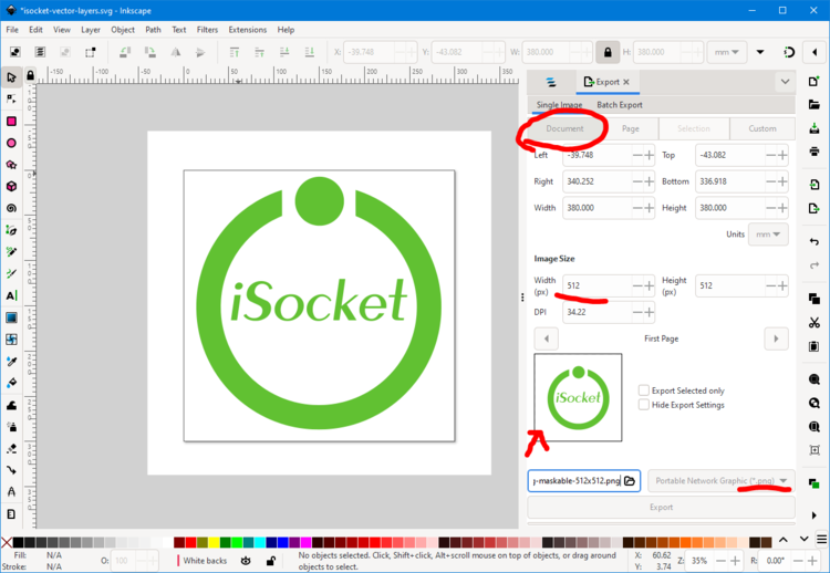
and here is the result (the dark area is not part of the icon, as in all cases above):

Non-maskable (any or regular) icons for the manifest file
The layer setup is actually the same as for the favicon - see screenshot 2 because we want a round white background. And the export dialog for PNG is the same as there - see screenshot 3. We only change the dimensions. Yes, and everything else for SVG is similar, but okay, let's repeat.
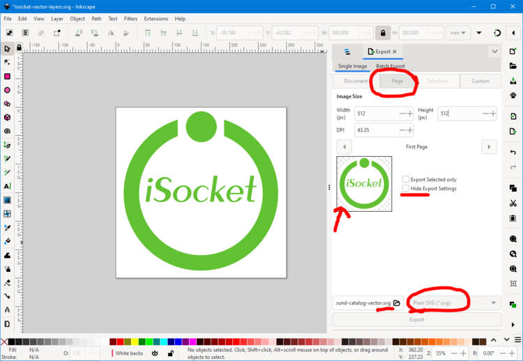
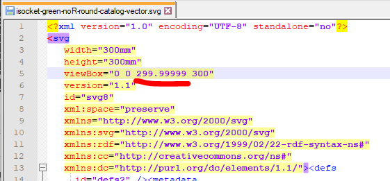
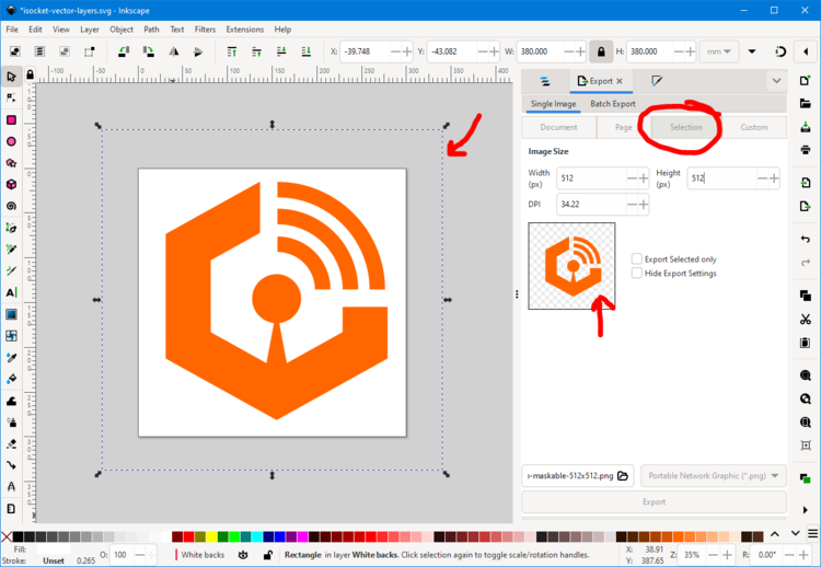
Finally, if you ever need a transparent background for the masked icon, you select the hidden(!) background layer and export the selection:
